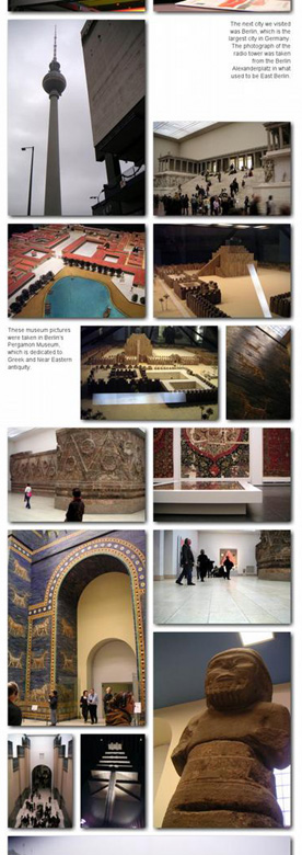
As the regular reader of this blog knows, I spent the holidays in Germany, and subsequently posted
a bucketful of pictures to flickr.
I eventually ended up spending a little too much money printing those pictures out in photobooks; first, through QOOP’s integration with flickr, and second, through iPhoto’s book publishing. I also tried Tabblo’s book features, but more on that later. Two popular options that I didn’t try were Blurb and Shutterfly, though I’ll probably try those out after I come back from Hong Kong and Vienna.
QOOP book publishing through Flickr has two great advantages:
- it’s really, really easy, and it’s really, really fast.
- it preserves all your Flickr titles and photo descriptions.
The end result, however, it much more suited for keeping a hard copy of your digital photographs than it is a coffee-table book. The cover is very attractive, but the printing inside uses a relatively corse halftone screen. The speed of the process comes at a cost—the layout is a fixed number of photos per page (I went with two) and there are no options for changing size, orientation, changing captions, or the like.
The iPhoto book, on the other hand, is a magnificent, if rather expensive, production. There are multiple themes you can try, and you can move pictures around, change the number of photographs on a page, and the like. It’s incredibly easy to use, and is pretty smart about what you can do with your pictures (for example, it automagically recognizes vertically-oriented photographs and adjusts the pages accordingly).
Here are two short, but ridiculously large, pdf samples: Picturebook and Travel Scrapbook.
In addition, the print quality is outstanding. I still don’t know if Apple (or, more likely, their subcontractor) uses color halftone printing or if it’s some other process, but it’s professional-quality printing, on par with most coffee-table books.
The major drawbacks to iPhoto are, aside from the above-mentioned cost, the fact that it’s not available to non-Mac users and that even for Mac users, it’s a big giant memory hog (I have 1GB of RAM in my Mac, and it just chews up all the available RAM it can find).
As for Tabblo… I tried setting up a tabblo book, but I was consistently frustrated by the fixed photo sizes in the book layout form, and quickly abandoned that project. However, Tabblo is very good at layout for web display. It’s a drag-and-drop process that (I assume) make very liberal use of AJAX. It’s really rather remarkable that all this can be done inside a browser.
There are a few tweaks that Tabblo could make to make their already intuitive layout process even better:
- All the current layout schemes apparently lock you into a 800 pixel-wide display. This might have made sense in 1996, but given that the standard modern display is 1024x768, it might be time to loosen up.
- The grids that Tabblo uses for layout give you two levels of control—very loose or very tight. There needs to be an intermediate level.
- And most of the graphics used the turnkey layouts… well, they aren’t exactly avant-garde.
This brings me to the major difference between Flickr and Tabblo: Flickr is very good at the community tools, and they’re very good at displaying and sharing individual photographs. They aren’t, however, very good at sharing large groups of photographs. It’s much easier to go through my Germany pictures on Tabblo than it is to do the same in Flickr.
The obvious solution would be for Flickr/Yahoo! to buy out Tabblo, but I don’t know if that’s going to happen.


