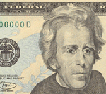
 The new $20 is out.
I like it.
The back of the bill appears to be almost identical to the back of the current $20 bill (with the exception of an absent border and the addition of faint "20"s added in the background); the front has changed somewhat. If anything, the design cues that they're using harken back to 19th century currency while staying fresh (the eagle in the background, in particular, is very 19th-century). They took Andrew Jackson out of the oval outline and made the picture, if anything, slightly bigger. It's still very clearly US currency; it's not like the designers followed the technicolor lead of the euro or Canada.
Can't wait to get my hands on one of them.
hey - i've always liked our currency compared to yours. when i look in my wallet i can tell how much cash i have in their just by the colours.
Hey they're classy, so un-Euro like... designing currency would be a great graphic design gig...