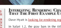
Dave Hyatt is looking for rendering regressions in the new version of Safari. I got one here:
In Safari 1.2, the gray bars in the title field had a few extra pixels of padding on the top and the bottom, due to a line-height: 120% line specification (as seen here in a Firefox screenshot):
However, in the new version of Safari, that extra padding has vanished entirely:
It’s unclear what happens when the title of an entry extends over two lines. Update: Bad news:
That sure don’t look so good. Here’s the offending style:
.title { font-family: didot, bodini, palatino, georgia, times new roman, serif; font-size: large; color: #111; font-variant: small-caps; text-shadow: gray 2px 2px 2px; background: #efefef; font-weight: bold; line-height: 120%; }